Developer Platforms
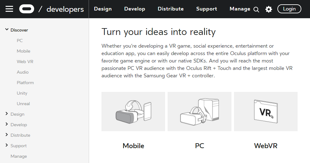
Building for developers is different. The people using these tools are technical, opinionated, and have zero patience for friction. They'll go around a bad experience — and at Meta, they were. Bug reports were landing on Reddit and Twitter. The developer center was buried under outdated Oculus branding and thousands of pages of documentation with no clear path through.
Developer Center
Overview
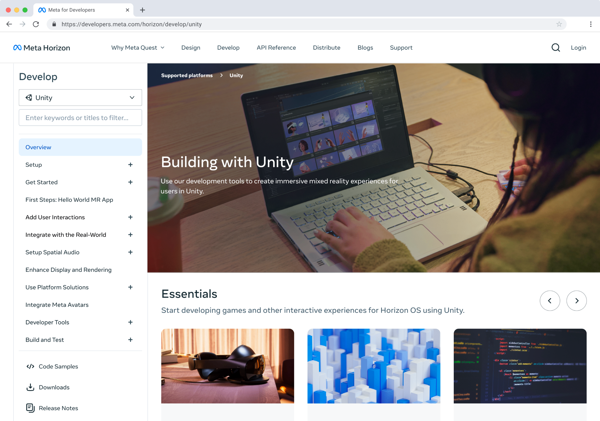
Meta's developer ecosystem had a scaling problem. As new build paths expanded — Unity, Unreal, Horizon Worlds, and new desktop editors — the developer center couldn't keep up. The site still carried Oculus branding, content was outdated, and developers had to dig through thousands of pages of documentation just to find what was relevant to them. At the same time, the audience was split: hobbyists building their first VR experience and professional developers shipping commercial apps had fundamentally different needs, and the site wasn't meeting either. I was the sole designer leading a cross-functional team of 14 engineers and 10 documentation engineers to redesign the developer center end to end.
The approach
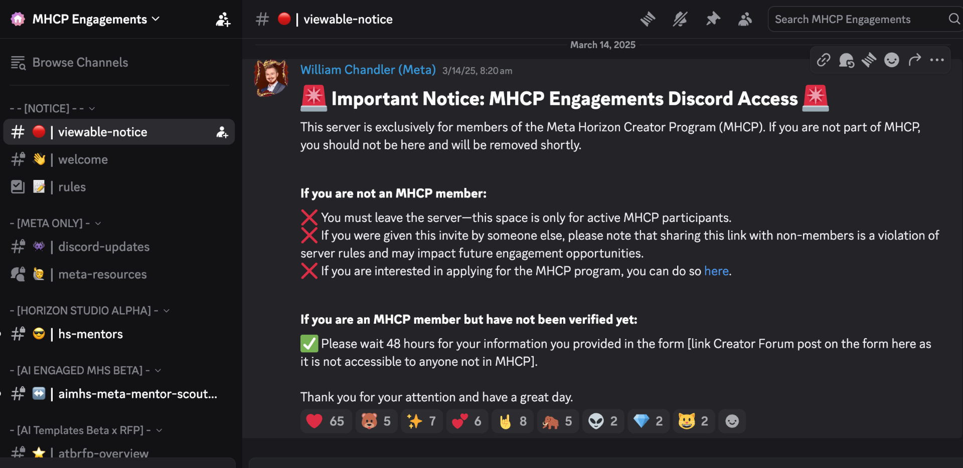
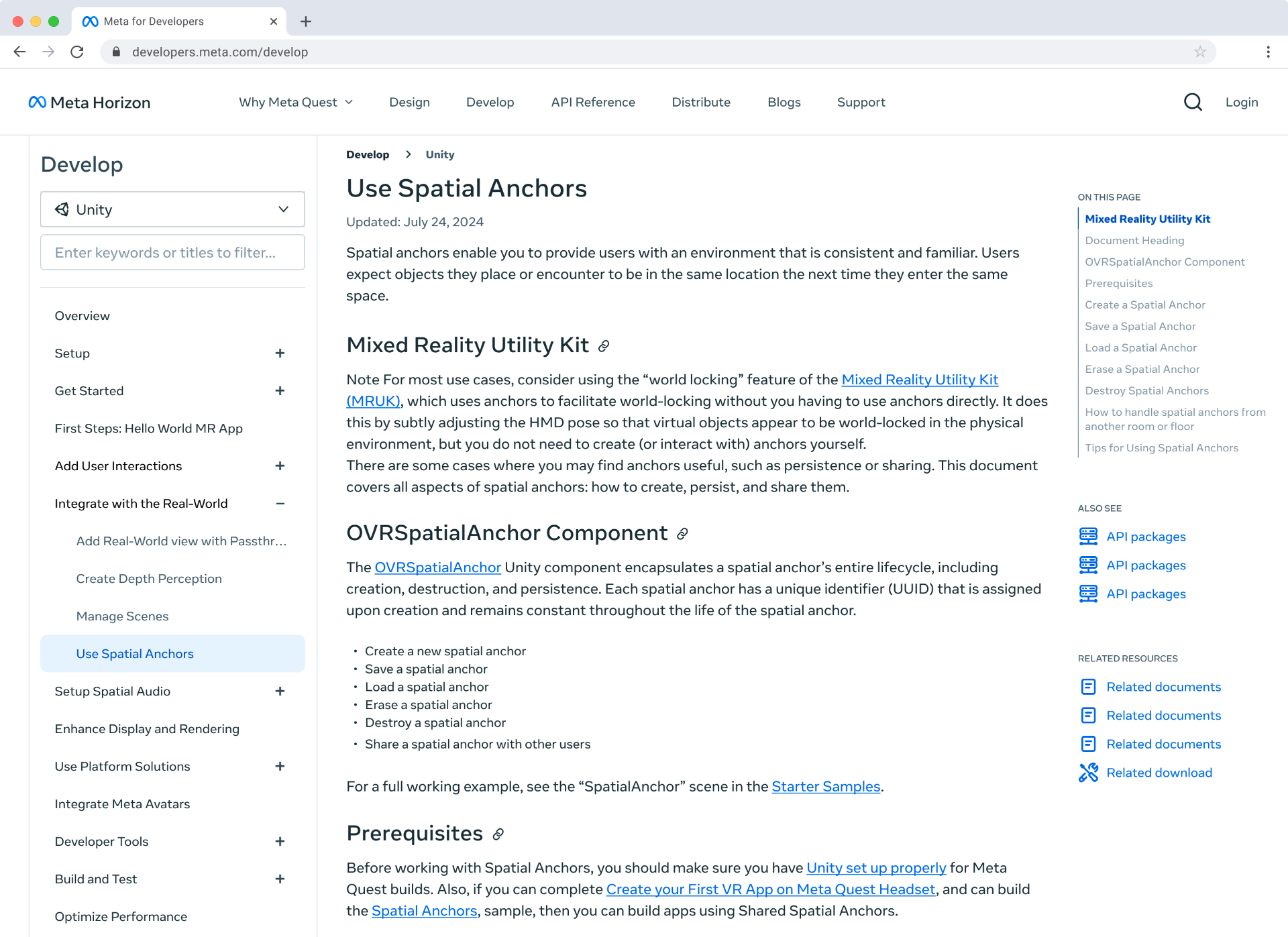
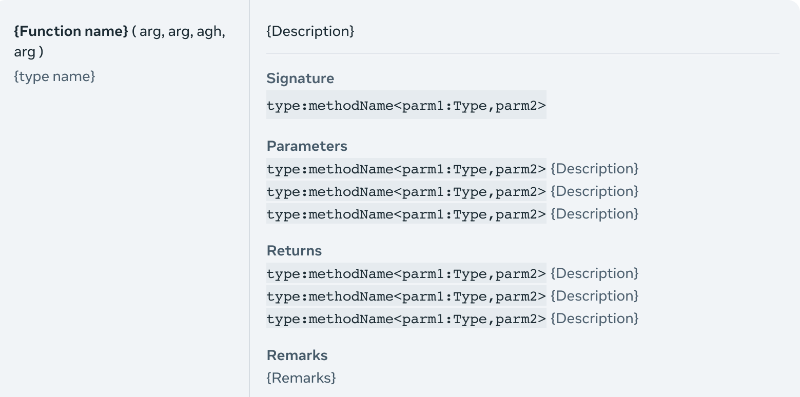
Without dedicated research support, I went directly to developers on Discord — getting real-time feedback as features were being built. This proactive outreach was recognized by leadership as going beyond the scope of my role, and it became a core part of how the team validated decisions throughout the project. The redesign focused on meeting developers where they were. We rebuilt the navigation from the ground up, creating clear pathways for each build type so developers could find what was relevant to them without sifting through irrelevant content. We significantly improved the API reference — prioritizing quick code access and copy functionality that developers actually need day to day. And we began prototyping an AI-powered search experience to further reduce friction in finding the right documentation across thousands of pages.
Outcome
Developer platform engagement increased. App submissions grew significantly over the years following the redesign, and adoption of Meta-specific SDKs rose — a direct signal that developers were not only finding the platform but building deeper within it.
Feedback Hub
Overview
Before Feedback Hub existed, developers hitting issues in the Meta Quest development process had nowhere official to turn. Bug reports and support requests were scattered across Reddit and Twitter — an unstructured, unreliable loop with no visibility into status or resolution. There was no consolidated place to submit an issue, track it, or know if Meta had even seen it. In two months, a four-person tiger team — one PM, two engineers, and me as sole designer — shipped an MVP to production. Feedback Hub became a dedicated tab inside MQDH, the desktop companion tool developers already used daily. For the first time, developers had a single, structured channel to communicate directly with Meta.
The design
The core flow was built around three moments: All cases — a clear overview of every issue a developer had submitted, with status at a glance. Start a case — a guided submission flow to capture the right information upfront, reducing back-and-forth. Case status — a detailed view of an individual case, showing progress and any communication from Meta.
Internal partner tool
On the Meta side, I designed an internal partner tool for the team receiving and managing these cases. What started as an internal tool for the Quest developer team quickly got attention across Meta — Instagram, Facebook, and WhatsApp teams all took notice, leading to cross-org collaboration and company-wide impact. (Screens for the internal tool can't be shared publicly.)
Outcome
The internal tool created a ripple effect across Meta's major platform teams, sparking collaboration that extended well beyond the original scope. Developer satisfaction with the support process improved significantly following launch.